
I was at a discussion group for a well-known sports brand recently. They asked each of us what we look for when we go shopping for sportswear or trainers. It was my turn and I mentioned, among many things, that the trainers cannot be white or pink. “Why no to pink?” they asked.
“Well, because we aren’t in the dark ages where our gender dictates what colour we should wear,” I said, knowing full well how they might be thinking oh lordy, not another feminist (though what’s wrong with that, huh?). And then I realised whilst saying that, I was wearing a pair of grey Nike trainers that had pink popping out, my sports bra underneath my top was a hot pink and the Core150 bottle stashed in my bag had a bright pink bottle lid. And then that made me think. I’m a walking, talking hypocrisy. Do I really dislike the colour pink?
Truthfully, almost all my bright pink sportswear was bought because they were the last colours in stock- although I only bought the sports bra because it was on sale for 10 euros. How could I say no to that?
But I digress. Whilst I actively try to avoid pink (unsuccessful as you can tell), many sportswear brands still heavily focus their product styles and designs on the old colour stereotypes – blue and red for boys/men, pink for girls/women. If the brands are feeling ever so creative, the other difference between the menswear and womenswear will be one low neck. Because, you know, v-necks for women and crew-necks for men. Ah-hah! Even the neck lines are formed on age-old stereotypes.
This isn’t so much a problem with the mainstream sports brands like Puma, Nike, Adidas, Sweaty Betty, Lululemon and Reebok. In fact, all these brands are very creative in their styles. Puma, Reebok and Sweaty Betty are my favourites for truly creative leggings that are also very comfortable when wearing during workouts. Yes, ok most of these brands do have pink products, but they generally sell products in a huge variety of colours. Pink falls only in one spectrum of the rainbow. They embrace colour and embrace the fact that women want to wear more than just pink. Core150 even actively advertise men using their pink-coloured lid bottle, which I love!
Do you notice something similar about all those brands though? They are, what I call, all-rounded sports brands: they don’t focus their target audience on one particular sport, but rather cater for a variety of sports. Compare that to running brands (only because I know running brands well, thought the same can be said about cycling and triathlon brands as far as I’ve seen).
The more focused the brand is on a sport, the more focused they are on the function of the clothing, and much, much less on the design. Yes, I agree function over design is very important in sports, but design shouldn’t be neglected to the extent that it’s pushed aside and the lazy way out for design is used. Whilst I need to feel comfortable in what I’m wearing when doing long-distance running or sweating it out in the gym, I also want my sportswear to look good. But why does it have to be pink?
Even flicking through my collection of Women’s Running magazines, dating from 2015-ish until now, I have noticed that a large majority of the front covers are based around a pink design and the products they rave about are pink-based. What is the need for this? Women’s Running is targeted for adult women – why do we need to be addressed as walking, running, talking barbies?
Things like this, drive me more to purchase and read more of the men’s products. At Runners’ Need, the trainers on display in the women’s section are more inclined to be of a pinky purple colour, or soft colours. The men’s shoes are more inclined to be of a range of colours – dark blue, light blue, orange, yellow, red or green. I used to be embarrassed that my trainers size is big enough to enable me to shop in the mens’ section of running shops, but now I embrace it as it brings on a wider range and shades of of colours. Give me more colour!
From what I see across sportswear brands, colour is used as a way to distinguish gender in clothing and it’s a way of emphasising our genders – pink gives a supposed sense of femininity for the watcher, rather than to the person wearing the top. If you’re in the gym, lifting heavy weights and you have a great set of muscles, a pink (v-neck) top will just provide a reminder to your surrounding fitfam that hey you’re a woman. Because, obviously, men don’t wear pink.
At the Ritz-Carlton hotel, where I was staying in Dubai for my work recently, whilst I was impressed with their huge range of weights, what I noticed was that they had a pile of light dumbbells in the colours ‘baby yellow’ and ‘baby pink.’ Why did they need to have lighter weights in those colours? Let’s be real. I saw those dumbbells and immediately avoided them. Firstly, I’ll just say that I don’t use 2kg or 3kg dumbbells, but my second thought was, I don’t want anyone to think I lift light. And then that made me think. Men, especially in the Arab world, are very focussed on being and looking strong. I mean, there ain’t no way you’re going to see a male Arab sportsman go vegan – yalla, where are they going to get their protein from? From tofu? You’re having a laugh.
Putting jokes to a side, my point is this. Certain colours and shades can infantilise an object. Some men new to exercise, may have looked at those dumbbells, and actively avoided them as I did. Except for the reason that they may feel that it demasculinises them. A man using dumbbells less than 10kg? Wallahi, he’s not man enough. Remember, the dumbbells are pink, which means they are light, which means they are for women. Now drill that into your brains.
And do I dislike the colour pink? As the half pink, half blue walls of my bedroom are stripped away and await a fresh slather of plastering, the fading remains of the colours remind me that I do like pink a tiny, weeny bit. What gets on my nerves is the way that certain sports brands are very gender-specific in their product design, and use pink versus blue as the lazy way out of designing products for their male and female customers.
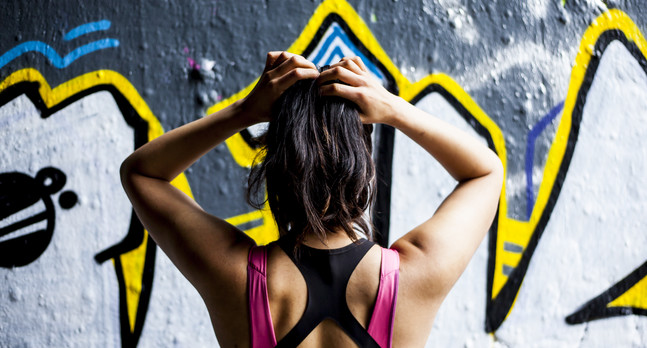
Sports top: Puma at TK Maxx
Sports bra: Brooks Moving Comfort
Photography: Chloe Knott